Context :
One of France's most prominent retailers hasn't updated its cash registering system for decades. Habits are strong but a lot of improvement can be made.
Goal: Studying the current cash registers and implementing gradual improvement to the system.
Timeframe: 12 months.
Role : UX Designer / Motion Designer
Process
In the retail industry, cash registers are the crux of the matter. That is why we started the project by methodically studying the pros and cons of the current system. Then we wireframed specific solutions for each problems identified. Finally we tested those solutions with users.
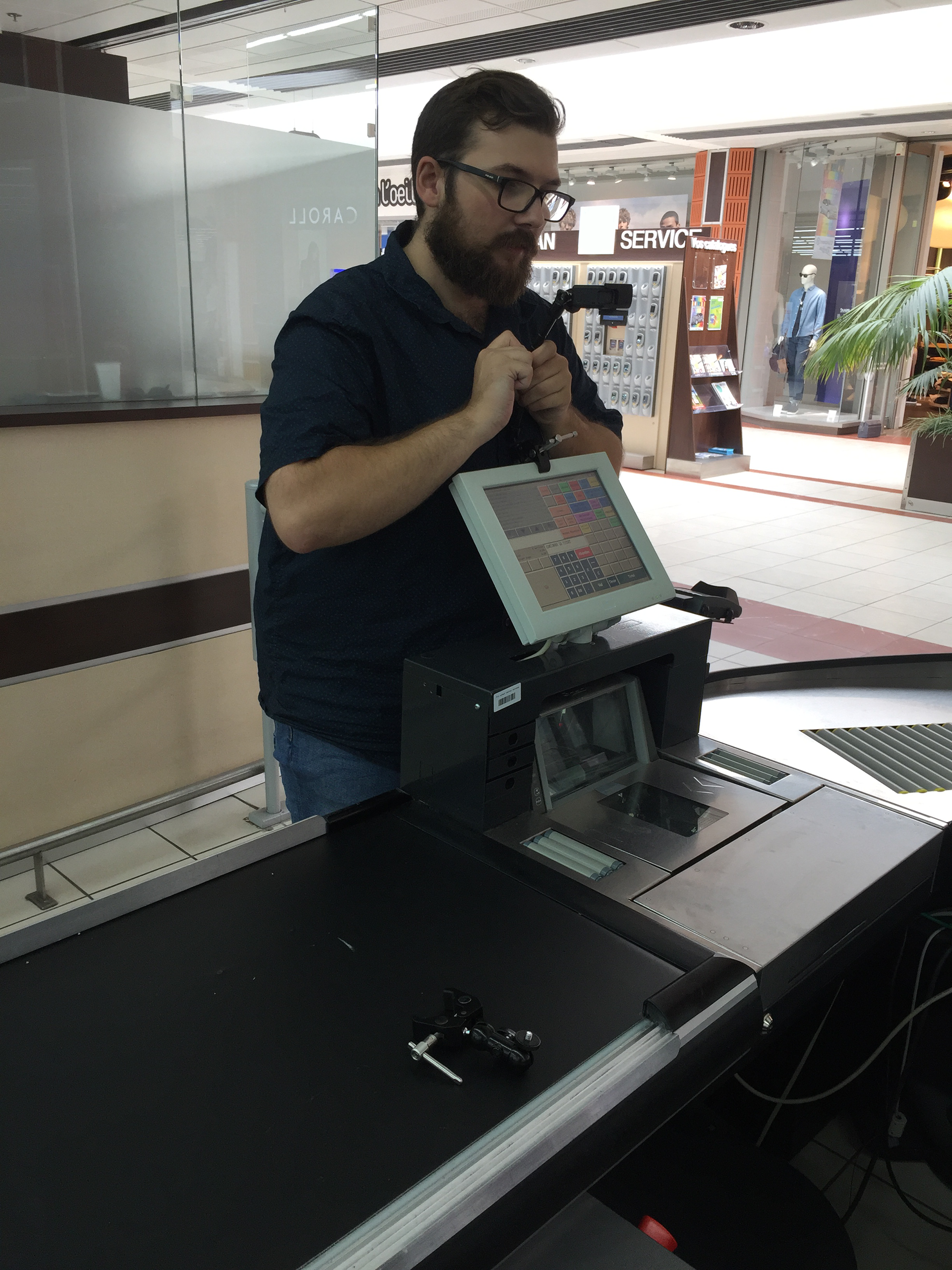
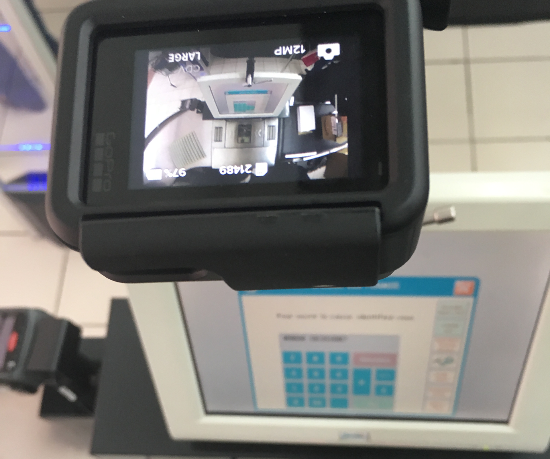
The observation set up.
Problem discovery :
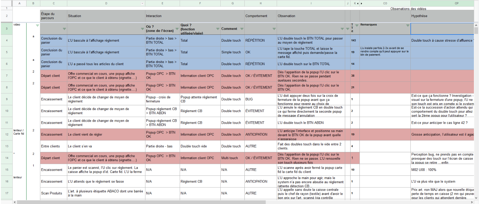
In order to study the current system we adopted both a quantitative and a qualitative approach. We observed hours of footage and logged all of our users mistakes and difficulties. We complemented those with field interviews in order to dig deep into specific problems.
Problem Definition :
Thanks to our interviews and observations, we realized that fruits and vegetables were an issue. Most users would lose a lot of a time and make mistakes slowing them down. We also realized that some previously designed messages were hindering their work and lead to mistakes. Overall users suffer from cognitive overload.
Problem solving :
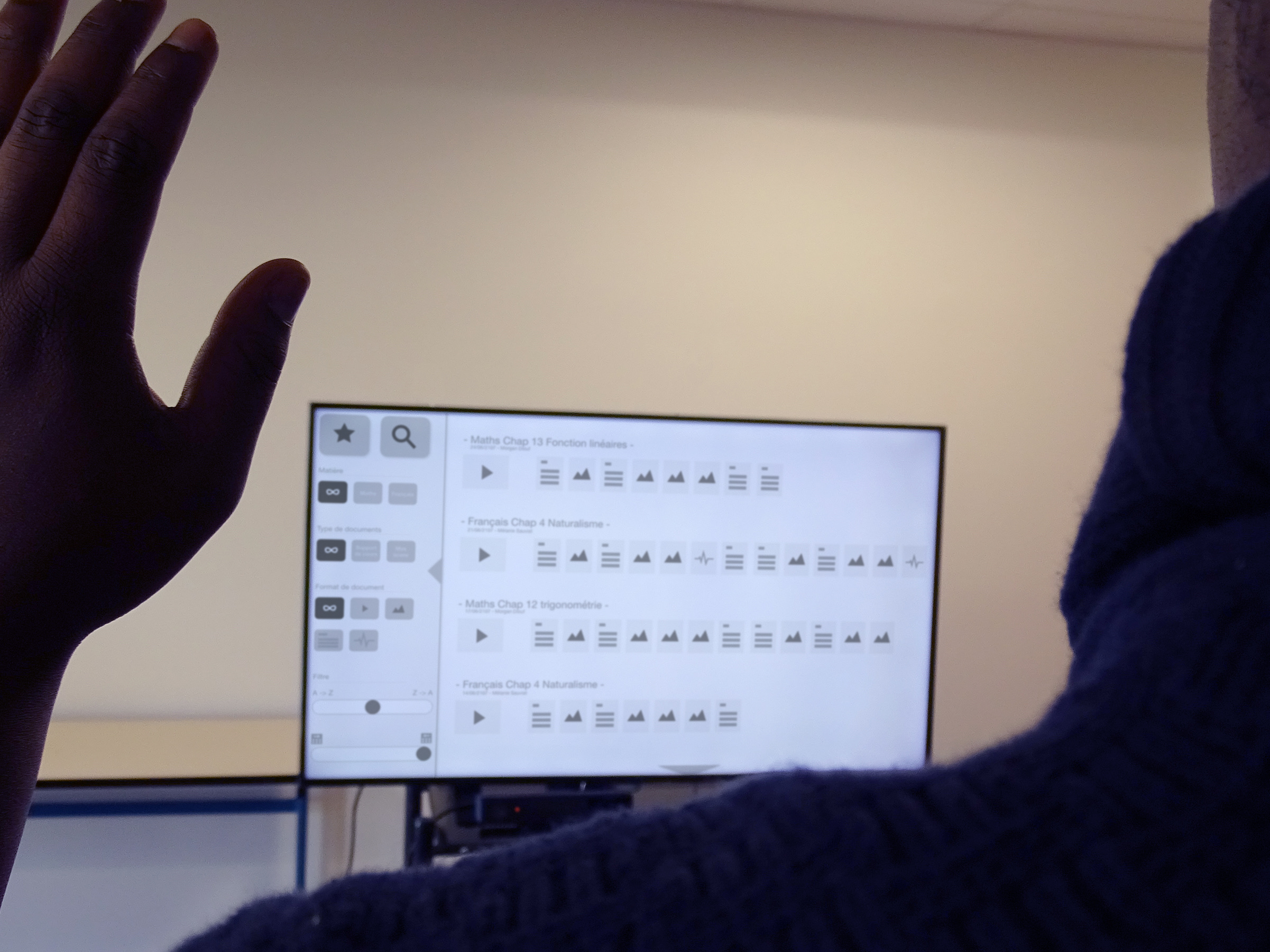
We created a few very basic prototypes answering the different problems like cognitive overload, double touch, fruits and vegetable search. This is an example of a very early prototype to illustrate new interactions to be introduced to the cashiers.