Context :
Iris is the main product developed by NaturSoftware. The project was launched by two IT innovation consultants, who realized that Natural User Interfaces could solve a lot of their problems.
Goal: Building an NUI (Natural User Interface) based product that will revolutionize the way remote teams work together.
Timeframe: 18 months on and off.
Timeframe: 18 months on and off.
Process
Heavily influenced by the Lean and Design Thinking culture, our process was cyclical. I contributed to the project after the first phase of research and after the first MVP was built.
We followed a cycle similar to this one.
Testing :
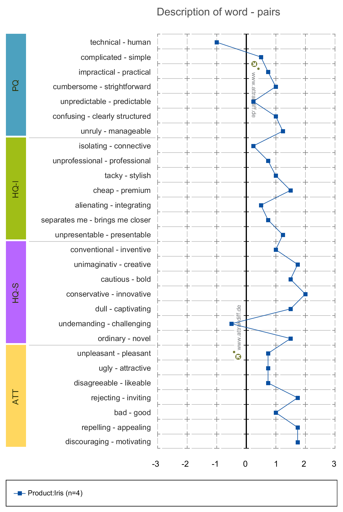
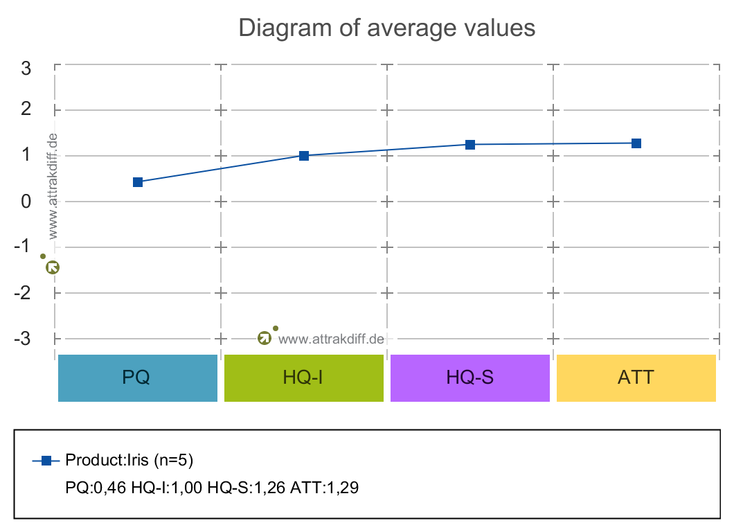
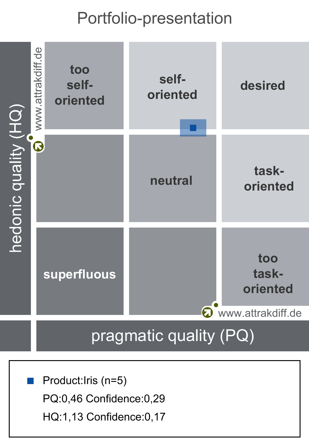
Every cycle would focus on different part of the product, answering specific questions (example: Is that functionality usable?). However among the first tests we did were the attrakdiff’ and the System Usability Scale. Those tests were the common thread to all of our tests to assess the general evolution of the product.
Every cycle would focus on different part of the product, answering specific questions (example: Is that functionality usable?). However among the first tests we did were the attrakdiff’ and the System Usability Scale. Those tests were the common thread to all of our tests to assess the general evolution of the product.
Ideation :
To solve usability issues, I led co-creation workshops with user. We gathered great insights on several topics such as gesture assignments, information hierarchy, features usability ...

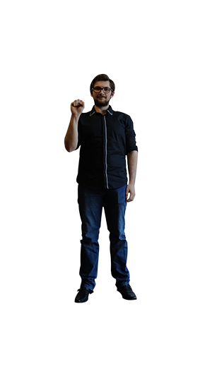
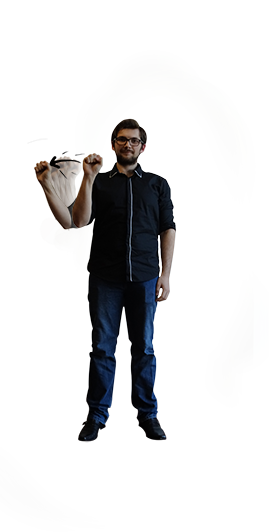
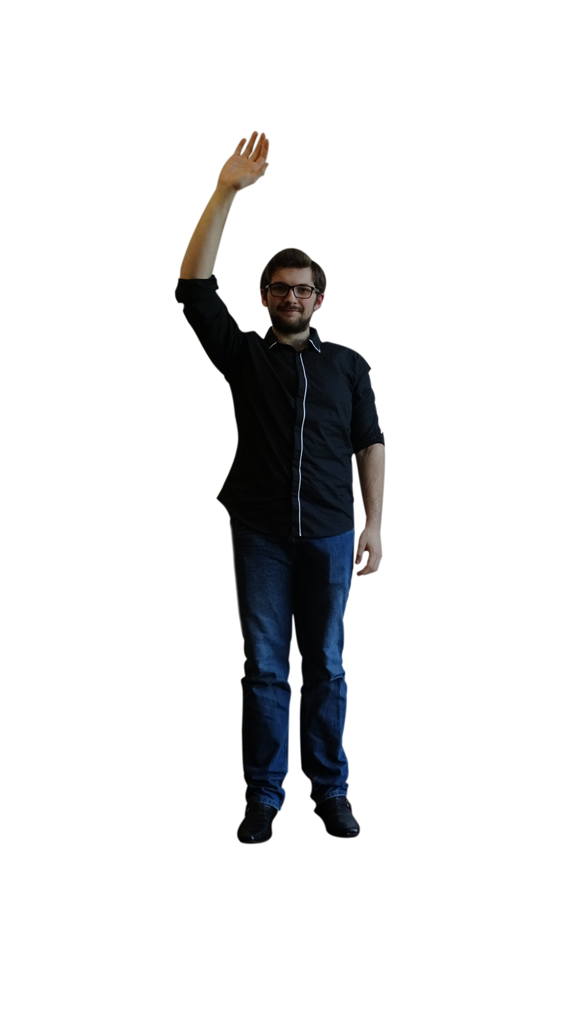
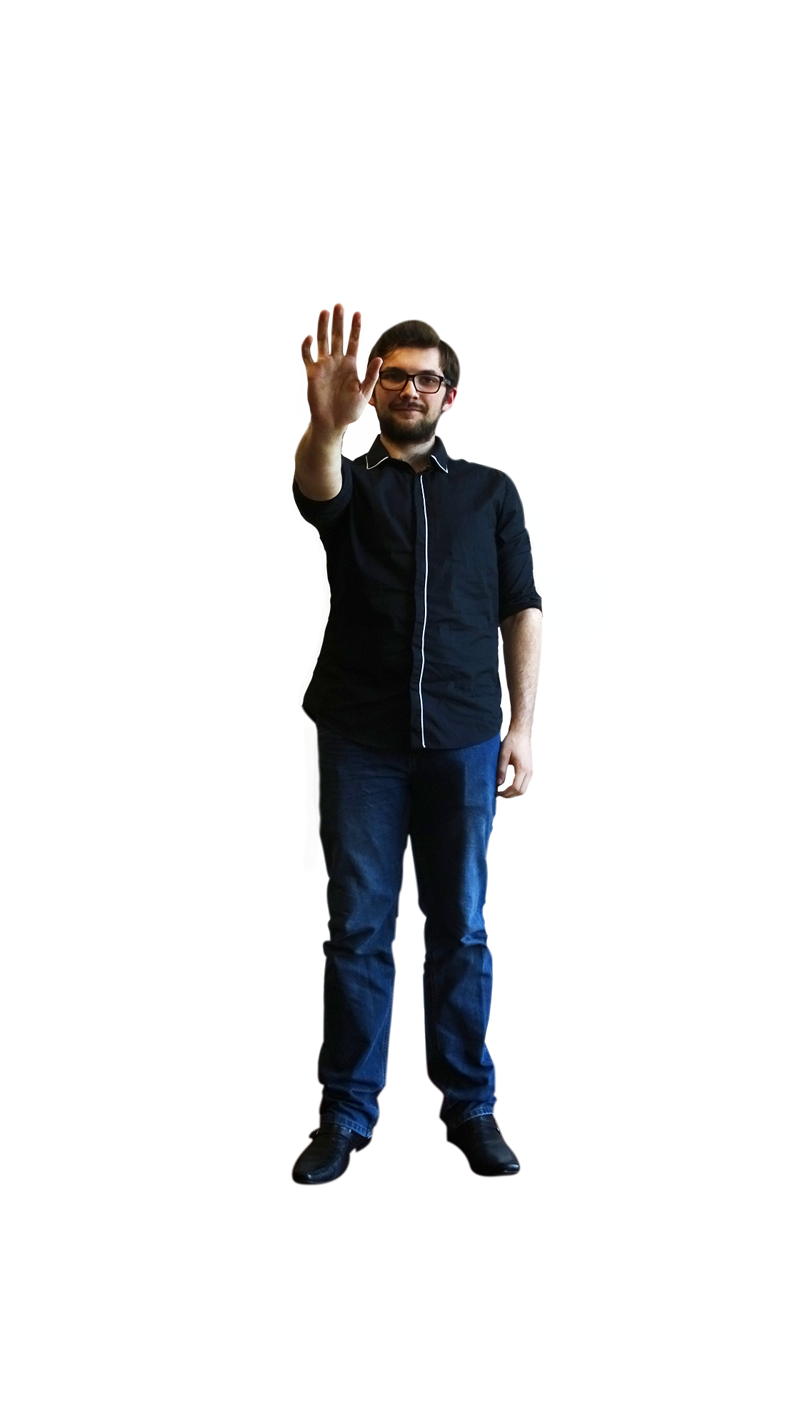
Some of the gestures workshops helped define.
Prototyping :
Prototyping was a huge challenge for us at first. We had to figure out how to implement new features to test them quickly without wasting too many resources. There were no tools available for Natural User Interface testing; Balsamiq, Axure or Adobe XD wouldn’t fit our needs in that case.
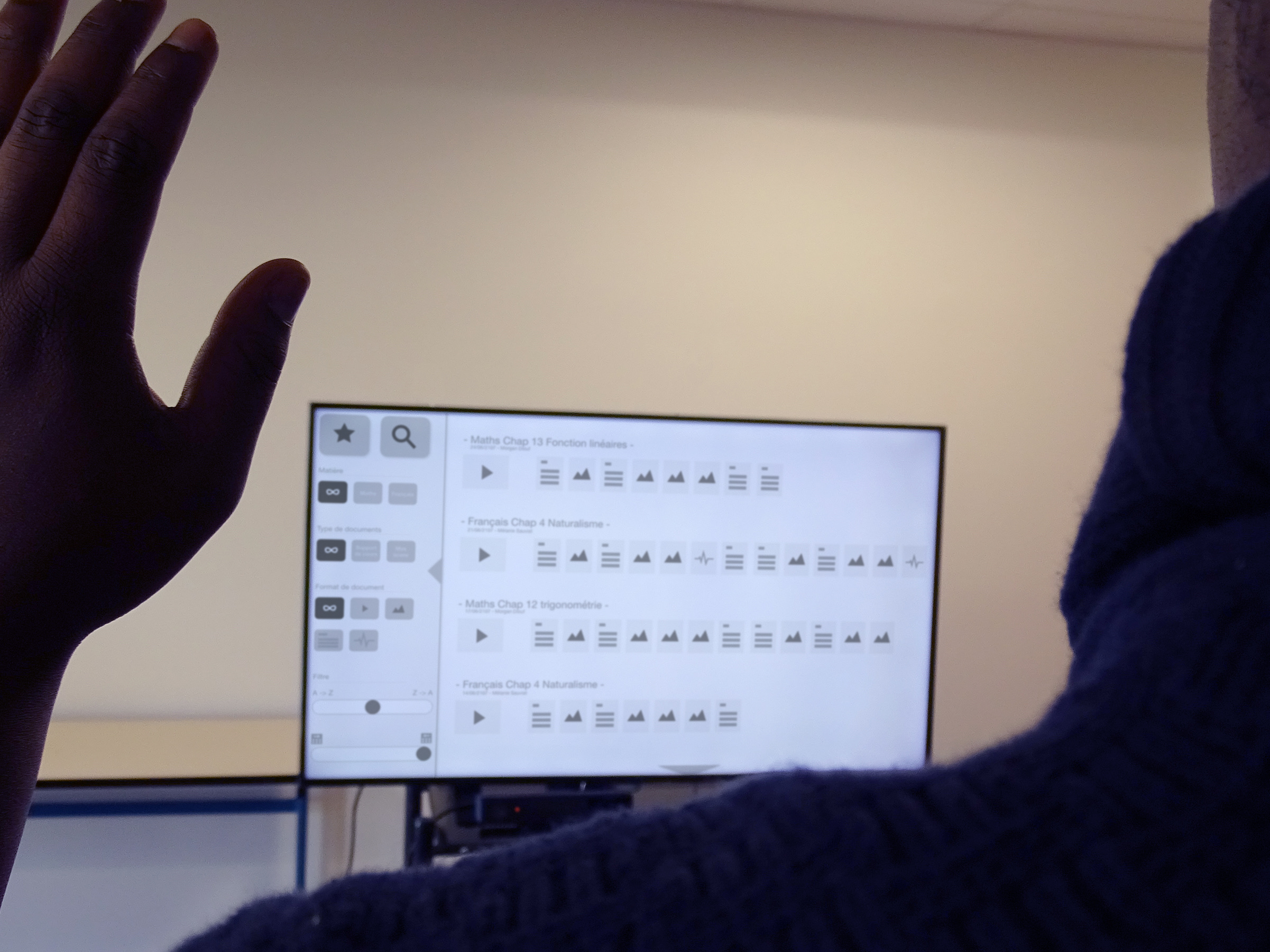
In order to solve the problem, I would usually build wireframes first and review them with a few users. The goal here was to detect any major flaws in our design.
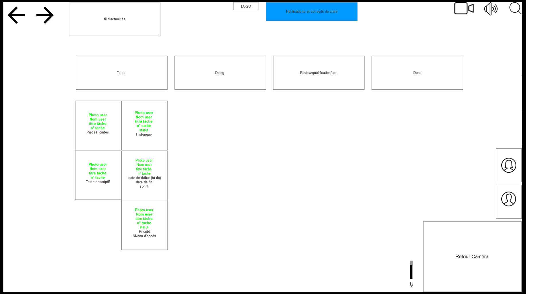


Some of our first wire-frames.
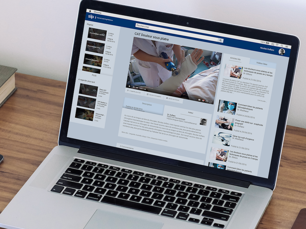
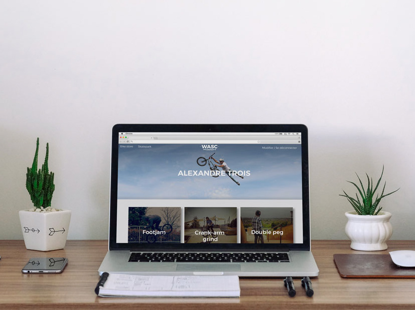
After that, I would build high fidelity Mockups that would be grossly implemented in the application, for it to be tested.
Representation of what a client receiving the product could expect.
(for privacy reasons this is not the actual product)
(for privacy reasons this is not the actual product)
In our case creating high fidelity mockups wasn't enough, indeed due to the nature of our product (based on Natural User Interface), we had to define how our application was supposed to interact with our users. To be more precise, we had to show how a gesture or a vocal command would trigger different functionalities and use motion to make it feel natural.
This video was made to illustrate how drag and drop should look and feel like.
