Context
When I was studying at IESA Multimedia, I had the chance to work on different projects. I was assigned a group project with a simple brief: build a brand-new physical experience. We decided to build a new experience for the BMX brand “We the People” (often known as WTP).
Original Brand Logo
Goal: Build an experience that adds value to an existing concept, thanks to digital tools.
Timeframe: As a group of 3, we had 6 days over 3 weeks to build our project.
Timeframe: As a group of 3, we had 6 days over 3 weeks to build our project.
Research
Reviewing the existing website :
We realized “We the People” (WTP) had a very good understanding of branding and its website was aesthetically pleasing with a very clean style.
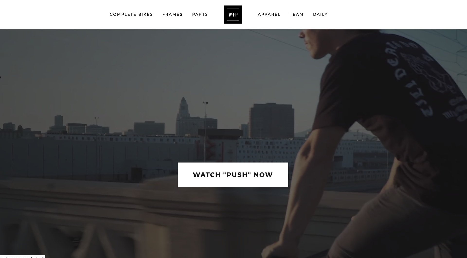
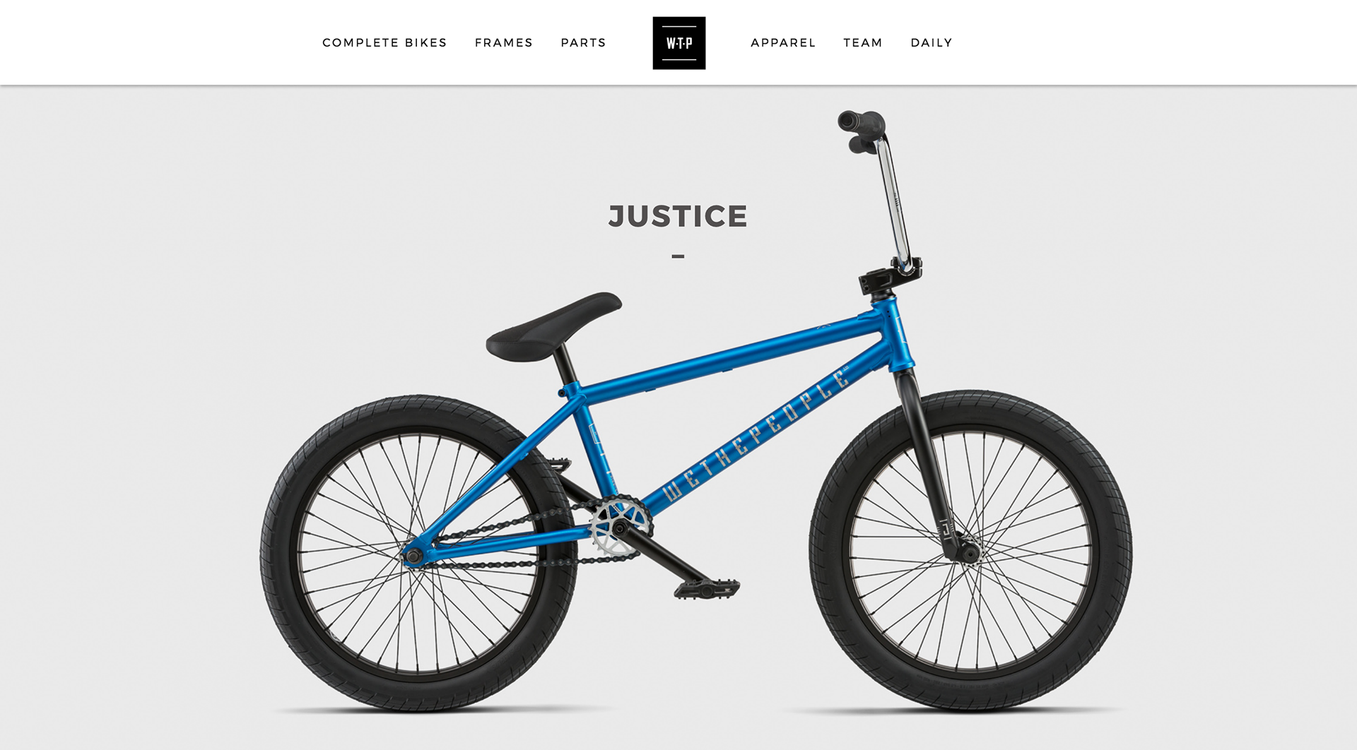
We built our project to be complementary to what is already set up. However, business wise the website seemed to fall short on several points. Calls to action were rare and did not always work properly.
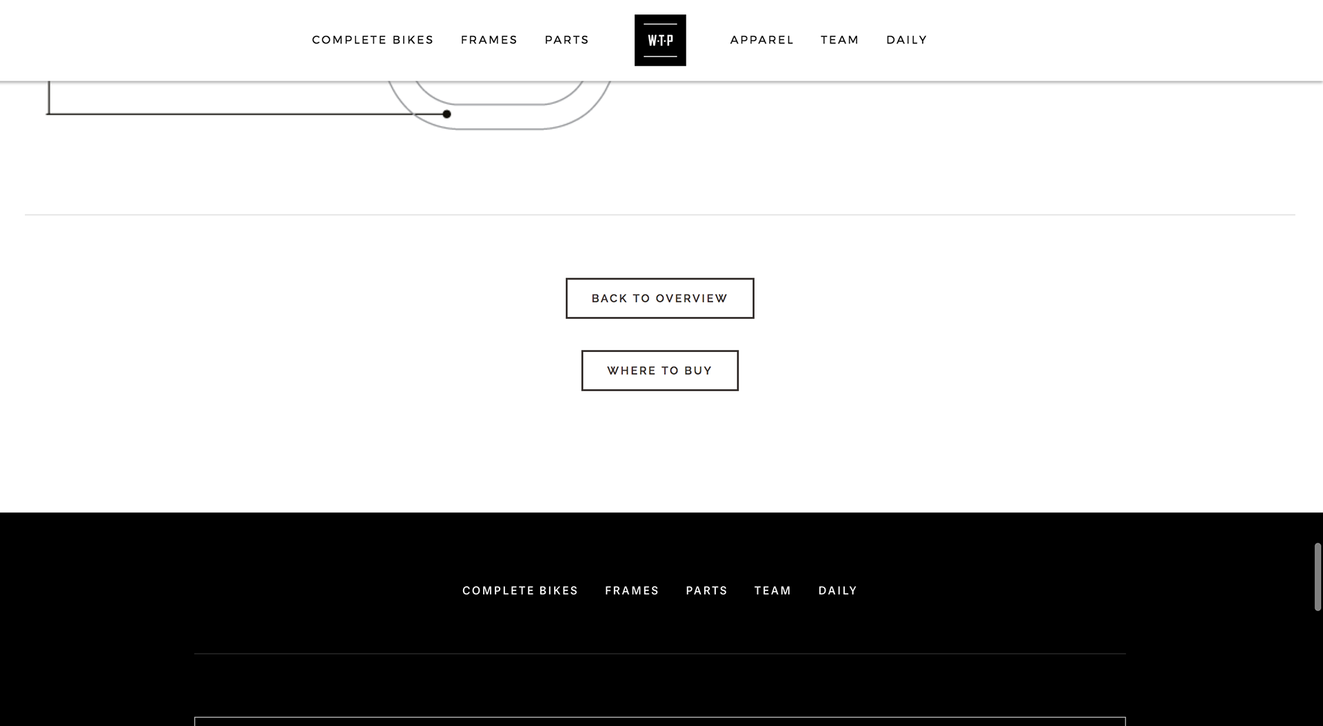
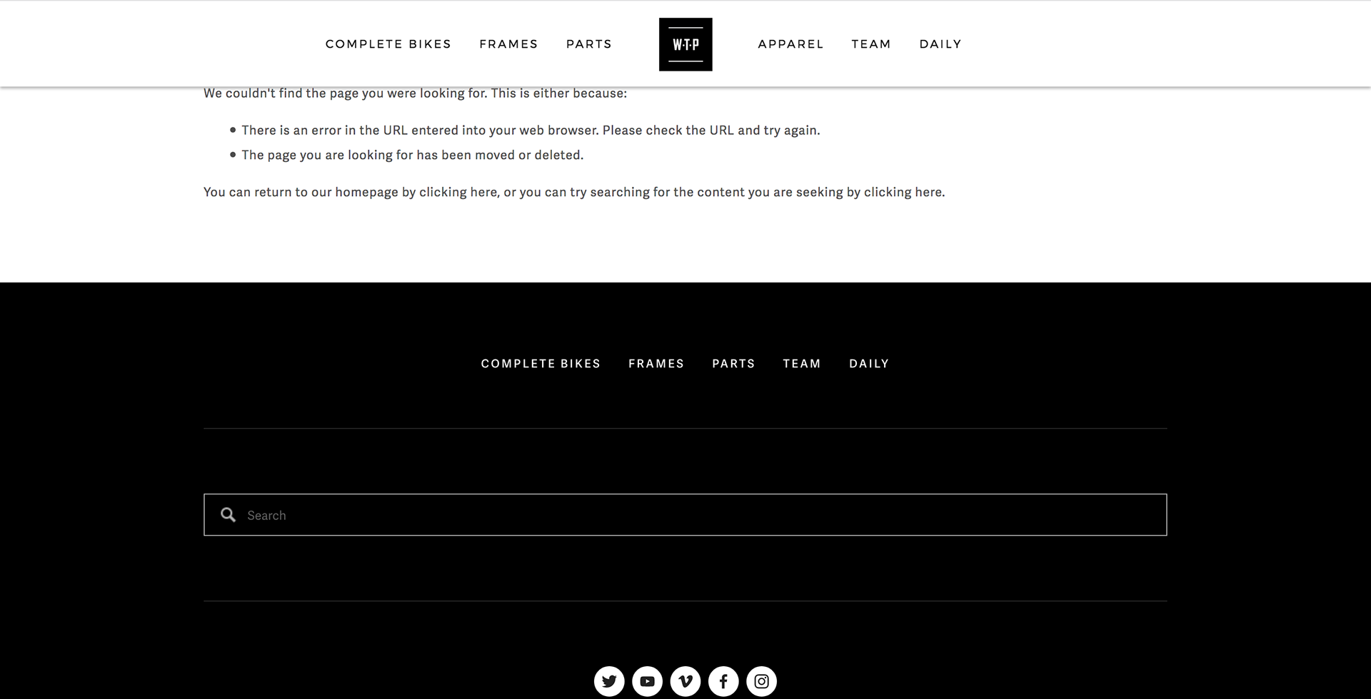
The call to action sits at the bottom of the page (screen 1),
is not different to any other button (screen 1)
and leads to an error (screen 2).
is not different to any other button (screen 1)
and leads to an error (screen 2).
Bench-marking the competition :
Most brands heavily relied on third party physical shops and big e-commerces to distribute their products. Such as Chain Reaction Cycles or Probikeshop. This approach doesn’t set them apart and doesn’t allow them to control every touch point with their client. They have very little control on the customer experience their brand projects. They are lost among the other brands, at the mercy of a harsh competition.
Most brands heavily relied on third party physical shops and big e-commerces to distribute their products. Such as Chain Reaction Cycles or Probikeshop. This approach doesn’t set them apart and doesn’t allow them to control every touch point with their client. They have very little control on the customer experience their brand projects. They are lost among the other brands, at the mercy of a harsh competition.
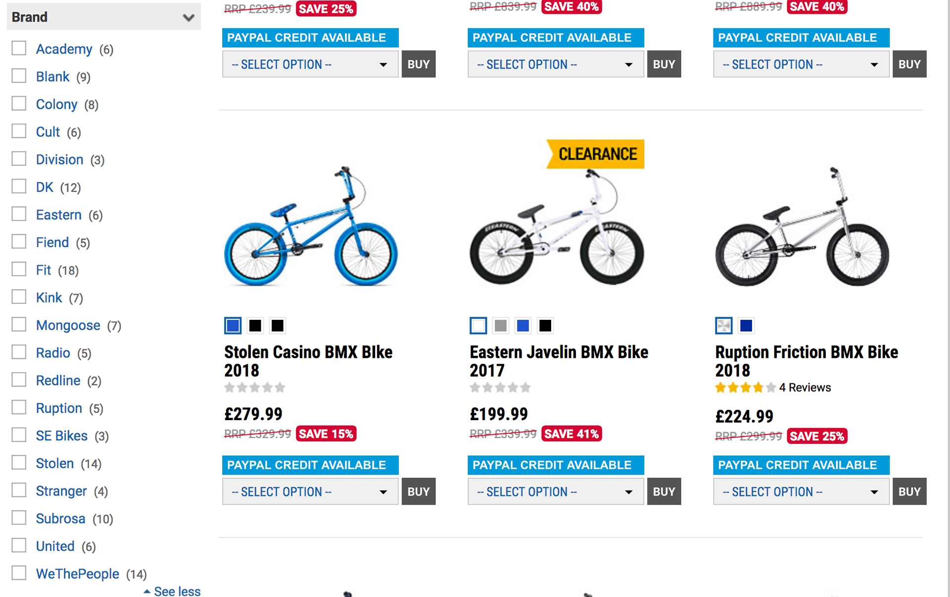
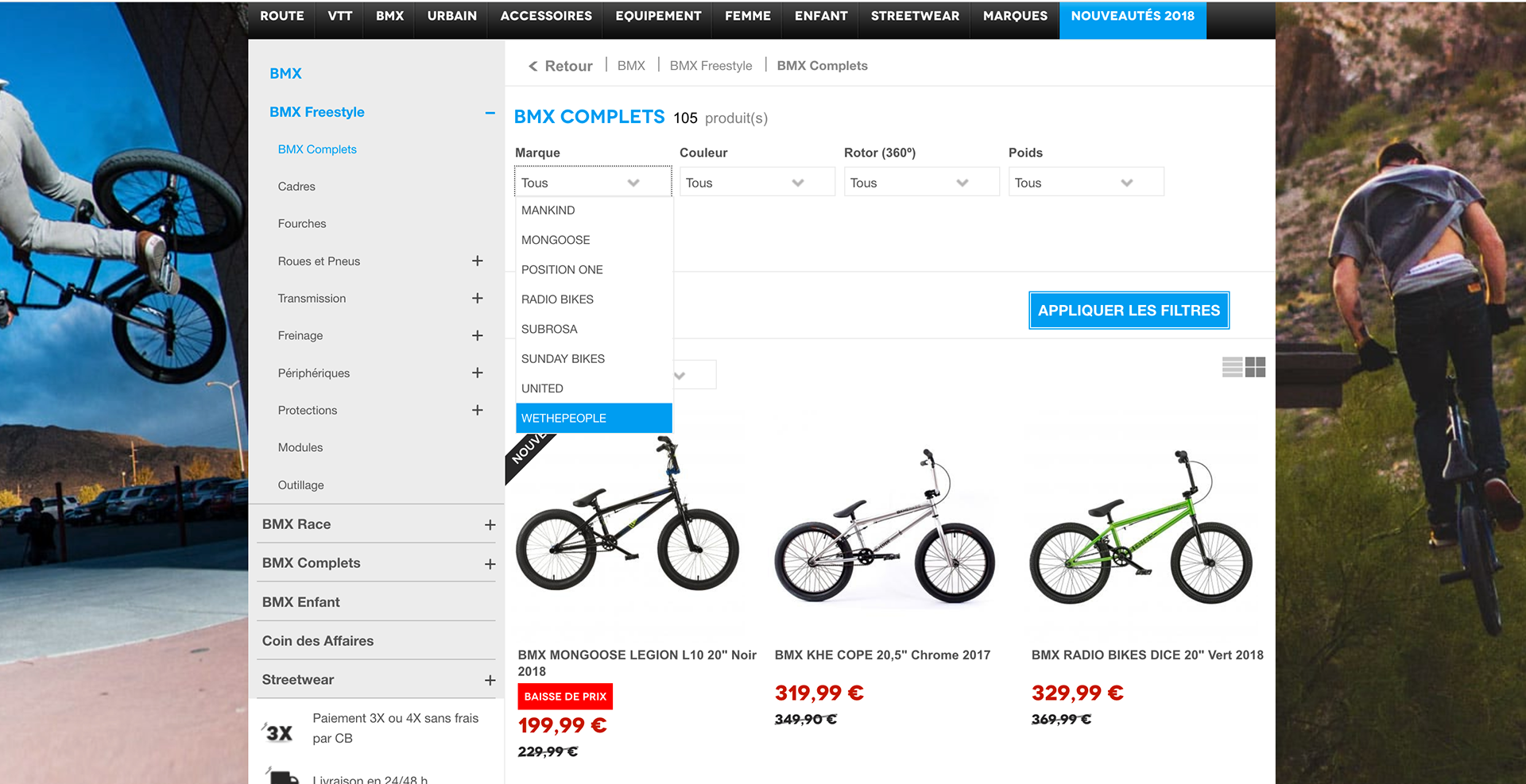
As seen here, lots of brands are competing.
Price are driven down and they have very little room to be different on these platforms.
Attracting their clients is a very complicated task.
Price are driven down and they have very little room to be different on these platforms.
Attracting their clients is a very complicated task.
This is an opportunity for WTP to be different. To be more present, and to have more control over their customers' experiences.
Ideation
635 Brain-writing :
Taking into account all of our resources (or lack thereof), we opted to generate Ideas with the 635 brain-writing methods.
Usually consisting in :
6 persons generating
3 ideas each in
5 minutes
We transformed it into a 6310:
6 persons generating
3 ideas in
10 mins
Usually consisting in :
6 persons generating
3 ideas each in
5 minutes
We transformed it into a 6310:
6 persons generating
3 ideas in
10 mins
The idea of “We The People Action Sports Complex” (WASC) was born.
1 / The “We the People” connected skate-park : enable riders to improve their riding by getting metrics and replay footage of their riding.
a. UX wise this is a great feature used by professionals on dedicated facilities in the US and is extremely rare.
b. Being a rare and high value feature, this would be the best skate-park of the region, attracting lots of riders.
a. UX wise this is a great feature used by professionals on dedicated facilities in the US and is extremely rare.
b. Being a rare and high value feature, this would be the best skate-park of the region, attracting lots of riders.

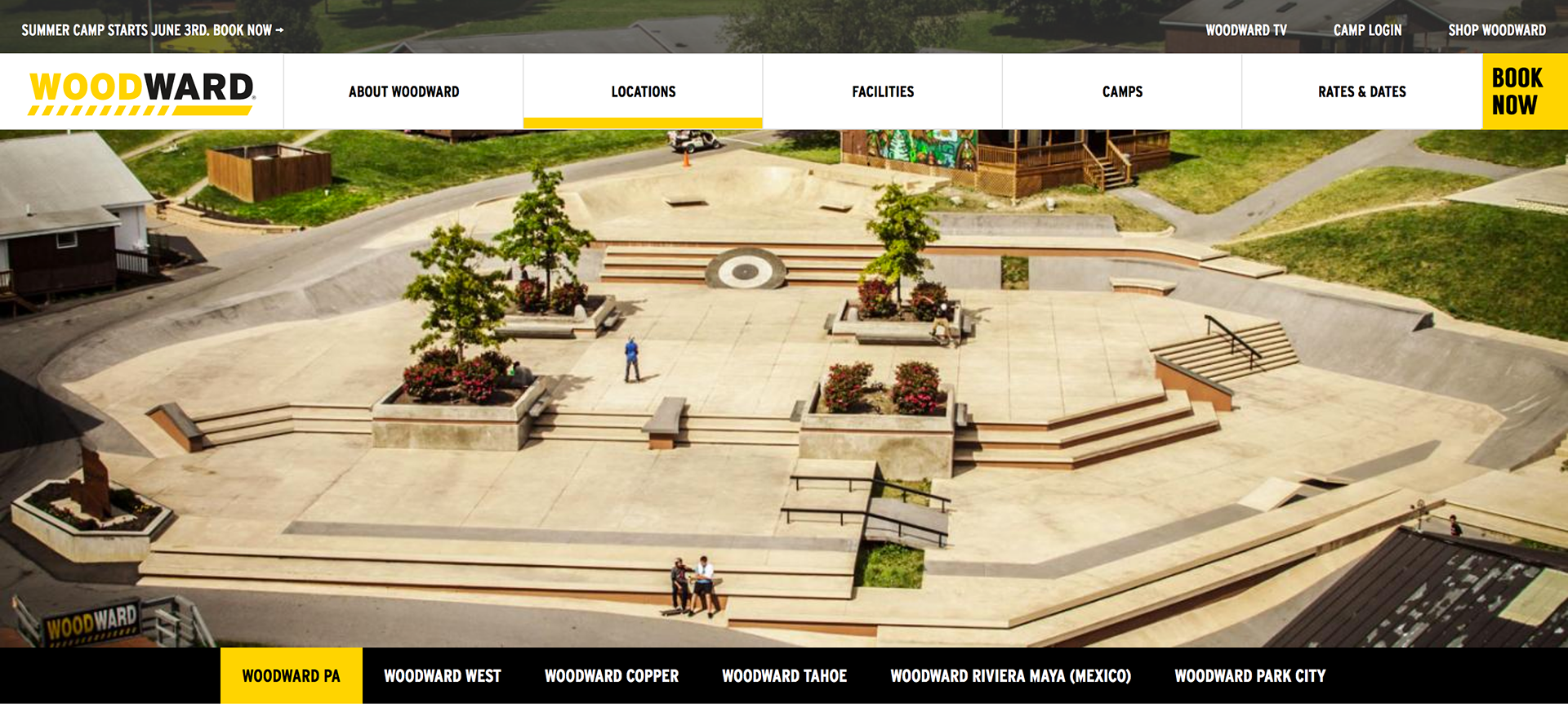
Riders from all around the world are ready to travel to these skateparks because of the quality of their facilities.
2. The "We the People" store at the entrance of the skate-park. As people would walk into the store, they could shop for a BMX or subscribe to be able to ride the skate-park. Also, next to each bike, a transparent display panel could show the bike specifications and some footage of the specific model being ridden in this skate-park.
Simplified plan of the skatepark inspired by existing designs. We created and used this plan to help design an MVP.
3. The off-site experience: the WASC website would be connected to the main WTP website. On that website, users could obviously subscribe to the skate-park, buy parts or bikes to be picked up in store. But the main value proposition would reside in a personal online replay space through which users could study their ridings from anywhere.
Prototyping
A rough user flow :
In order to sort out our ideas and see how our ideas would apply, a rough user flow seemed useful. It showed the different touch points and ways users could subscribe to the skate-park and give us their information.
A few wire-frames :
Our experience involved designing several interfaces for different devices, we only wire-framed the most complex ones in order to save time.
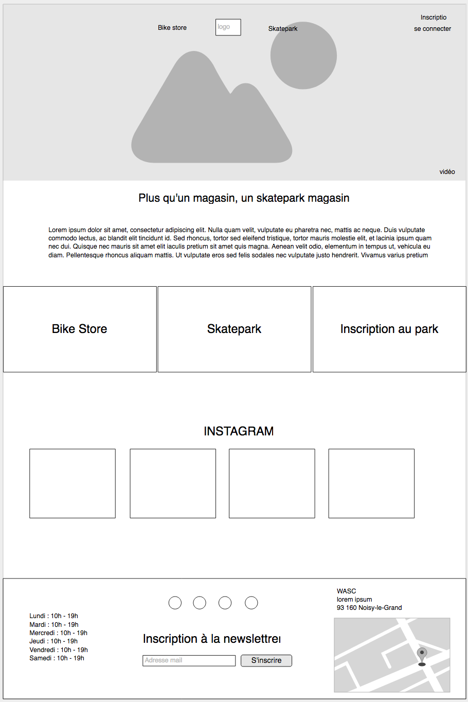
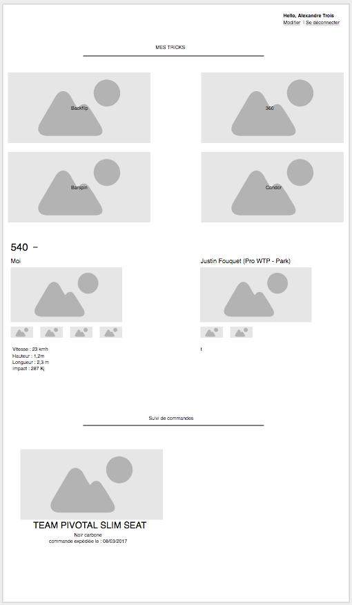
High Fidelity Mock-ups :
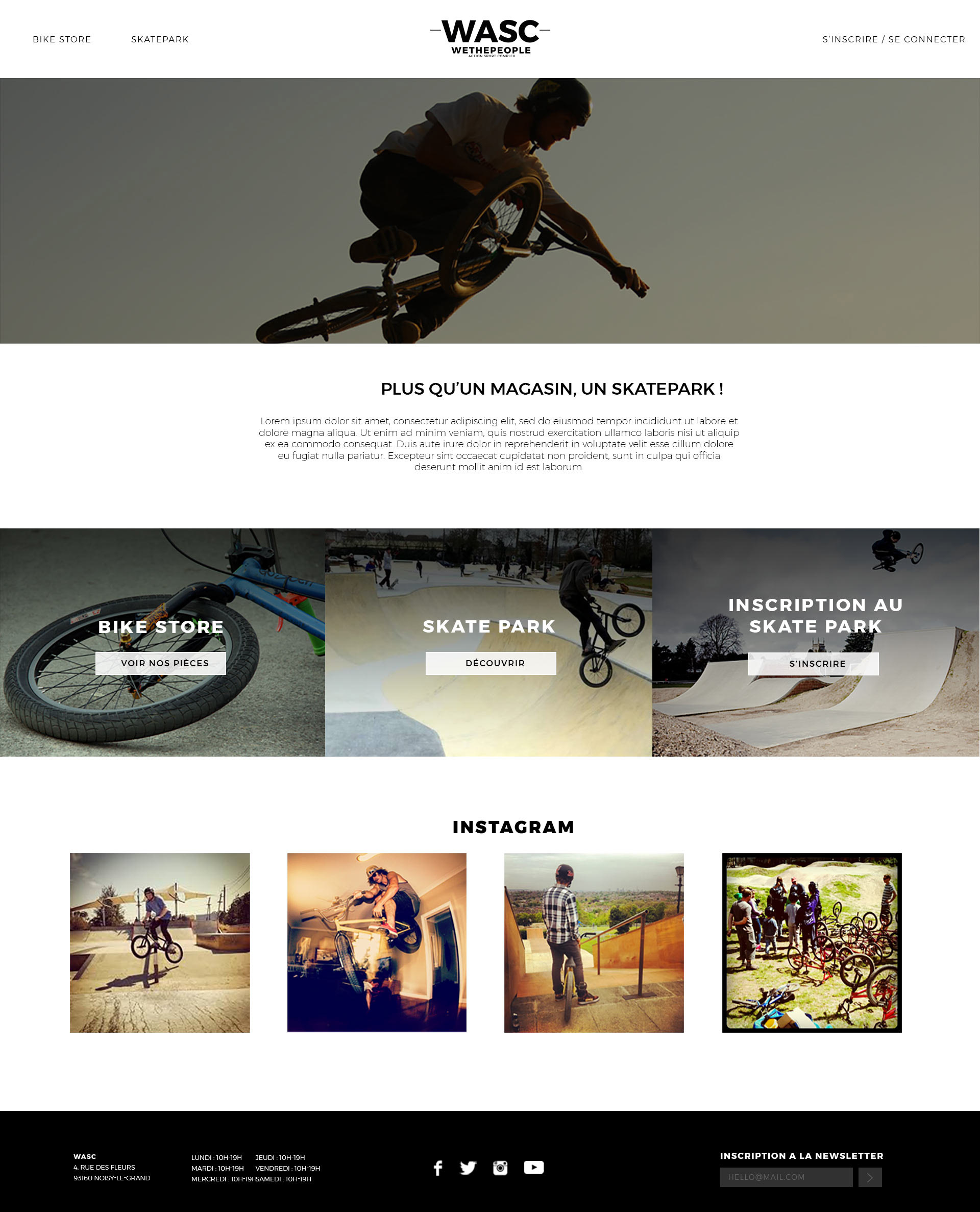
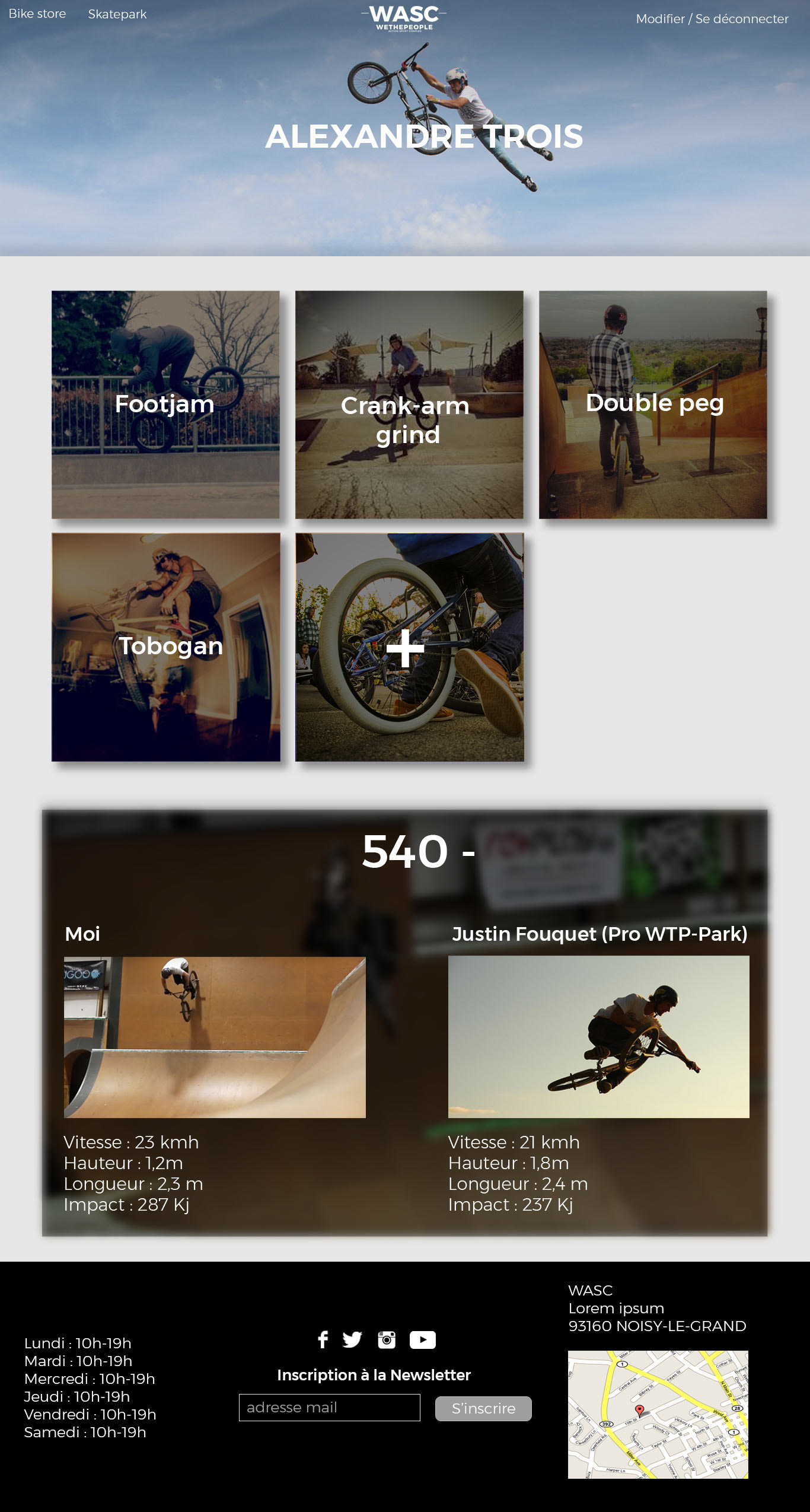
Based on our wire-frame, we managed to build a few High Fidelity pages. Those pages will be central to the experience because they are the link between the brand and the customer when they are not on the skate-park or on their bikes. It is also a way to entice them and make them come back. It will also make them get familiar with the brand and possibly adopt it as an ambassador. Being able to progress so much thanks to the park and to show his evolution to his friends, are two ways the user will feel strong positive emotion towards the brand and develop an emotional long term bond.
Communicating our vision
Goal : Capturing a vision of our project that we could show on crowdfunding platforms.
Constraints : 2 days to do everything and at least 90% of original content.
Constraints : 2 days to do everything and at least 90% of original content.
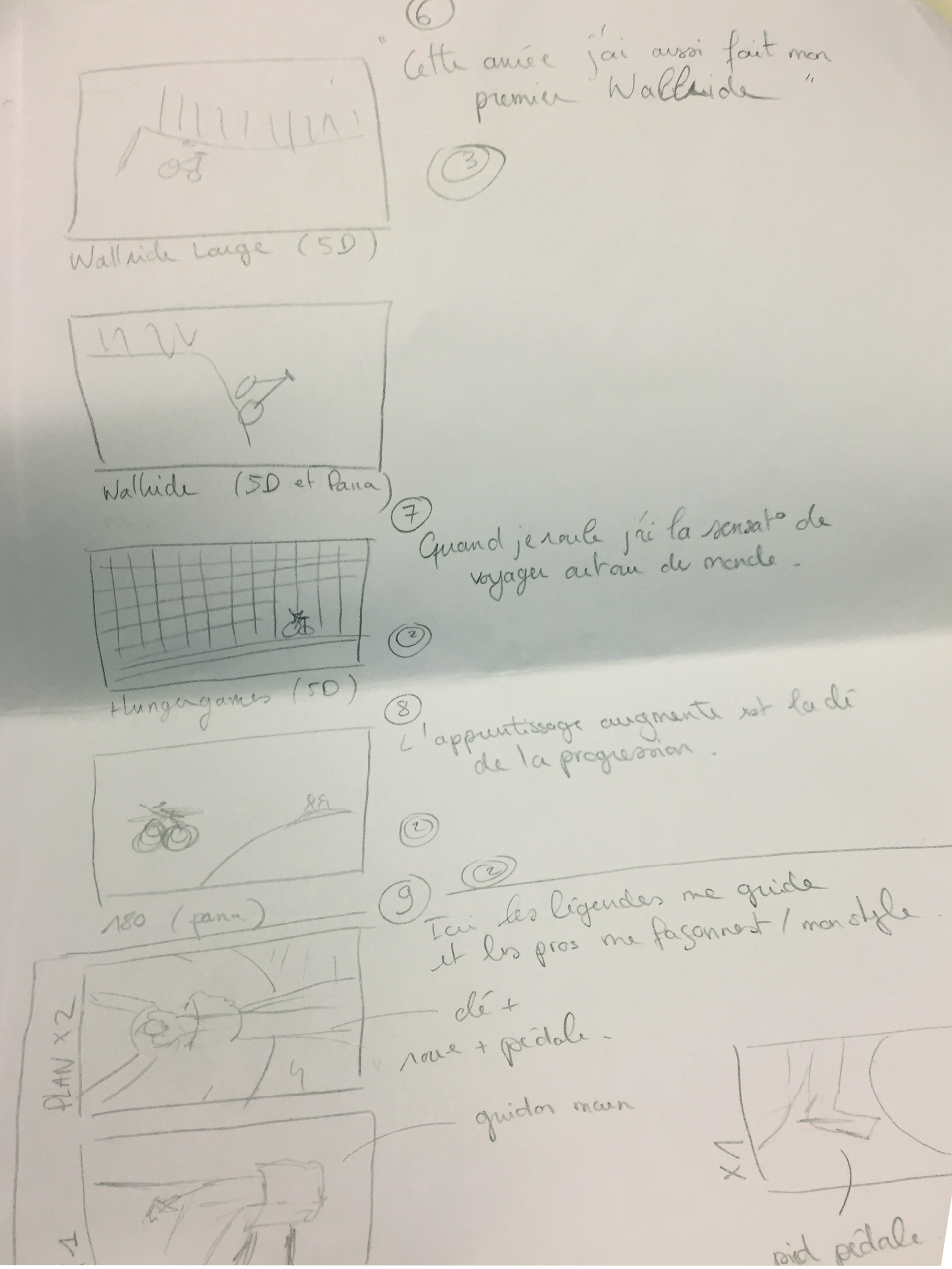
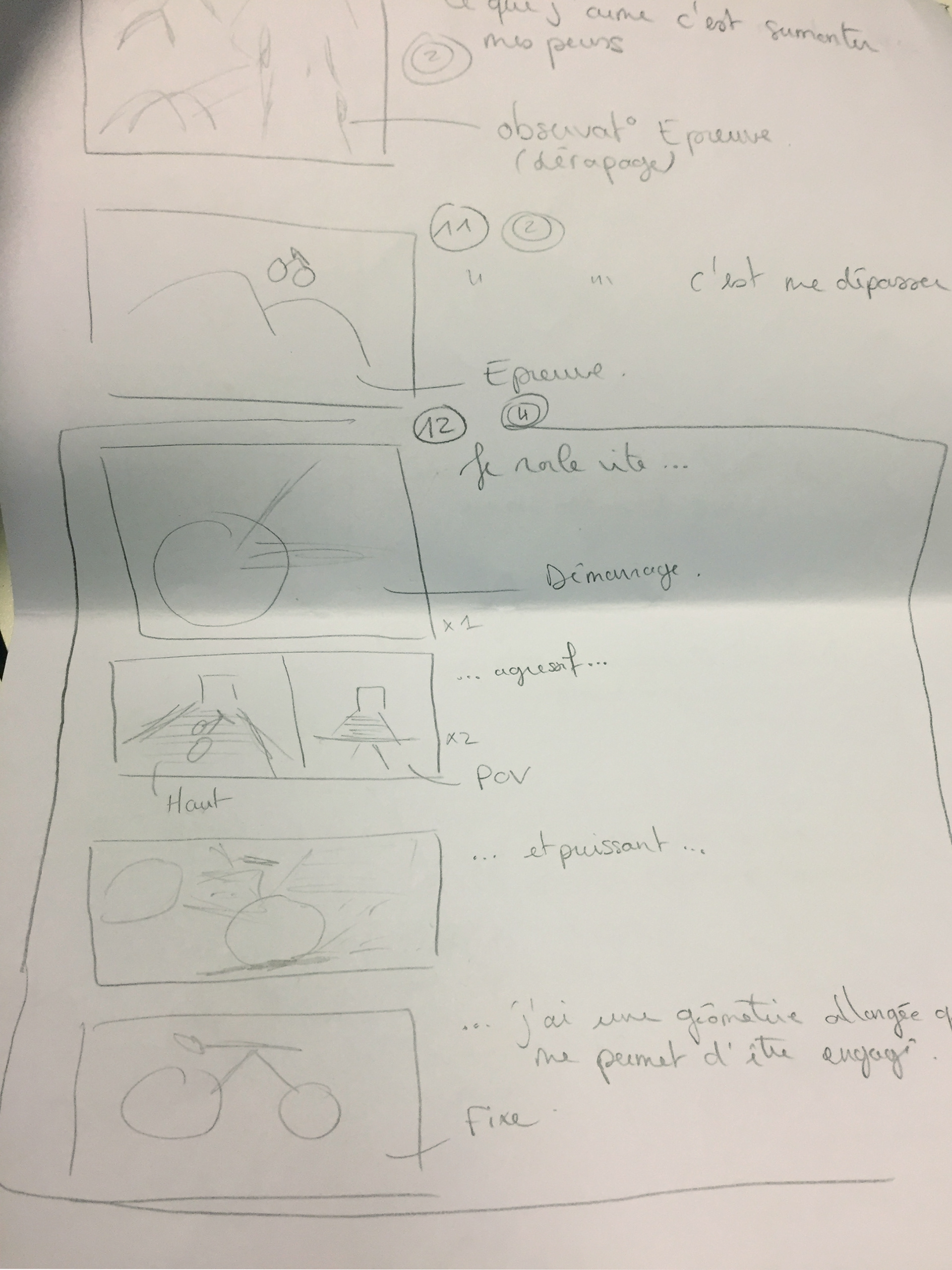
In order to complete the project, we also made a short marketing video showing off how we envisioned our project. But how do you create a promotional video for a skate-park that doesn't exist, with no budget and only 3 people? First, we have to tell a story.
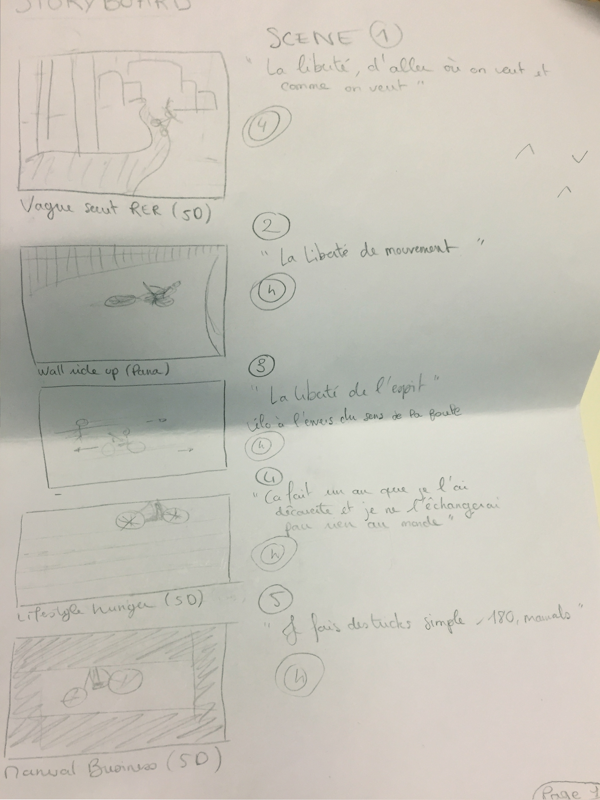
Story boarding
Having been a rider myself, I was familiar with BMX videos. I starred as the rider and helped in setting up the shots to get the most out of my amateur riding. This meant our resources were very scarce, so our story was made to get around this issue while being visually pleasing and entertaining.

Shooting the scenes :
The shooting was quite challenging. Considering that writing the script, the storyboard and planning the shots were made in 6 hours; we were bound to make mistakes. We went filming with the storyboard as a guideline but only shot part of what was planned and how it was planned. We had to get creative and push our boundaries.
The shooting was quite challenging. Considering that writing the script, the storyboard and planning the shots were made in 6 hours; we were bound to make mistakes. We went filming with the storyboard as a guideline but only shot part of what was planned and how it was planned. We had to get creative and push our boundaries.
Pushing our limits meant that we would eventually find them.
Tired from the rush and all the shooting, I made a mistake and fell.
Post Production
When we decided to show metrics, I already had a clear Idea of what we could do. I took charge of all the post production in order to ensure continuity in the style of the video. I was inspired by AJ Anaya's Series "How Tuesday" which allowed me to focus on more difficult tasks. One of them being creating credible footage of our non-existent skate-park.To do so, I took some third party footage and after effect to add our logo in for more credibility.
When we decided to show metrics, I already had a clear Idea of what we could do. I took charge of all the post production in order to ensure continuity in the style of the video. I was inspired by AJ Anaya's Series "How Tuesday" which allowed me to focus on more difficult tasks. One of them being creating credible footage of our non-existent skate-park.To do so, I took some third party footage and after effect to add our logo in for more credibility.
Final result
Final take on our promotional video. It goes to show how much we can get done with very little resources, Hackathon style.
